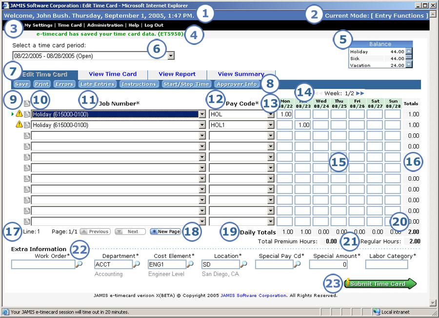
The Edit Time Card screen is where you enter the jobs and pay codes that you charged to and the hours on each day that you worked. It replaces the old Timecard Entry screen.

Below are descriptions of all the items on the Edit Time Card screen, including many new features.
|
This item... |
Is for this purpose... |
|
The upper-left of the screen shows your name and ID so you know that you are logged in as the correct user. You can also see the date and time when you logged in or last saved. |
|
The upper-right of the screen tells you the area of the application that you are working in: entry functions, approval functions, etc. The current mode corresponds to the option that you select in the menus noted below. |
|
The menus let you quickly navigate around the application. |
|
All messages appear on this line. Information messages, like the one shown above, are green. Error messages are red. Previously, messages appeared on separate screens that required you to click OK before you could return to the main screen. |
|
These are the available balances for absence pay codes such as vacation or sick. Unless an absence code is set up to allow overcharging, you cannot charge more hours to a code than the amount shown in the Balance box. In previous versions of e-timecard, you had to go to the pay code lookup screen to see accrual balances. |
|
If you want to work on a time card other than your current one, select it from the dropdown list, which shows the period dates and status for each time card. You can also select Archived time cards to look up a time card that was exported. In previous versions of e-timecard, you had to go back to the previous page to select a different time card period, and you had to go back two pages to select the archived time cards option. |
|
These let you select whether you want to edit or simply view the time card, as well as how you would like to view the time card data. You have these options:
|
|
This is where you go when you want to save or print your time card or view a variety of information that is not available on the main time card screen. There is now only one Save button instead of three. To replace Save & Submit, click Submit Time Card (see 23). To replace Save & Exit e-timecard, click Save first, then click Log Out. Not all of the buttons listed below always appear. For example, if you have no errors on your time card, then there is no Errors button. Or if you do not use job instructions, then there is no Instructions button.
Note that the old Timecard Entry screen had a row of links followed by a row of buttons, all at the top of the screen. The following options that previously appeared in that area are now on other parts of the screen: log out (exit), help, comments (text), submit (see 23), and moving to a different week (see 14). |
|
The active job line always shows an In essence, the entire time card is now open at all times, and activating a line takes just one click. In prior versions, you had to click Select or Verify, then wait while the line became active. There are no longer Select and Verify buttons. To validate data, simply click Save (see 8). Note that if you are in the View Time Card tab, you cannot click in the data fields. Instead, click The job line displays one of the following icons if it contains an error.
You can also see an errors icon next to the number of hours for the day or the period if the hours that you entered do not match your profile. Click Errors in the button bar to view a detailed list of all hard and soft errors on the time card. |
|
Click In previous versions of e-timecard, you clicked the Text button—either above the lines for the entire time card, or to the right of the applicable time card line—to enter new comments, or clicked Review Text above the lines to view existing comments. There were no icons to indicate whether lines or the entire time card contained comments. |
|
You can select any job that is in your personal job list from the Job dropdown list. In prior versions, you had to go to a separate screen to select even one job from your personal list. In addition to this new, quick way to select a job, all other ways of entering jobs are still available: selecting multiple jobs from your personal job list, manually entering a job, and selecting from the company job master if your company's setup allows this. New! The dropdown list shows both the job code and description. Your company's setup determines which of these the dropdown list is sorted by. |
|
|
You can select any pay code that is in your personal list from the Pay Code dropdown list. In prior versions, you had to go to a separate screen to select a pay code from your personal list. In addition to this new, quick way to select a pay code, you can also select from a master list if your company's setup allows this. If your administrator set up a default pay code for regular hours, then you can simply enter the job, then let the pay code default the next time you save. New! Depending on your company's setup, the dropdown list may display the pay code description in addition to the code. |
|
These show both the days of the week and the calendar dates that you enter time for. |
|
This item appears only for multi-week time cards. It not only shows you which week you are working in, but also lets you switch between weeks as follows.
|
|
Here you enter the hours that you worked for the job row/day column. |
|
The total hours that you worked for each job, which e-timecard automatically calculates as you make entries. |
|
Shows you the number of the job line that is active and the time card page that you are working on. If you have more than one page of entries, then you can click Previous or Next to move between time card pages. |
|
If you use up all the time card lines on the screen and still have more jobs to enter, click New Page to add an additional page of blank lines. |
|
The total hours that you worked for each day, which e-timecard automatically calculates as you make entries. |
|
The total hours that you worked for the time card, which e-timecard automatically calculates as you make entries. |
|
Separate totals for both premium (overtime) and regular hours. |
|
When you click on any field of a time card line, the Extra Information area below the time card lines displays data such as cost element for that line only. The extra information fields that appear, as well as the order they appear in, whether they are required or optional, and whether they are editable or display-only, vary depending on your company’s setup. You can look up any of the editable extra information fields if needed. Exception: Whether the open text (remarks) field has a lookup depends on your company's setup. In previous versions of e-timecard, you could view many of these fields to the right of each job line, but you had to scroll to see them, which meant that the entire time card was not visible at once. Note that your company's setup determines whether your time card displays work orders. If the work order does appear, then your administrator may choose to display it in the Extra Information area, or on the time card line to the right of the job field. |
|
Once you've made all entries for the period, click here to submit your time card for approval. In previous versions of e-timecard, you clicked Save & Submit in the button bar. Note that clicking Submit Time Card also saves your entries, so there is no need to click Save first. |